Problems with the layout in mobile version
-
Good afternoon family.
For the mobile version, I have created another layout with some variations. It happens that when I have the mobile vertically, it respects this layout but when I rotate it and put it horizontally, I get the desktop screen layout and it looks like this: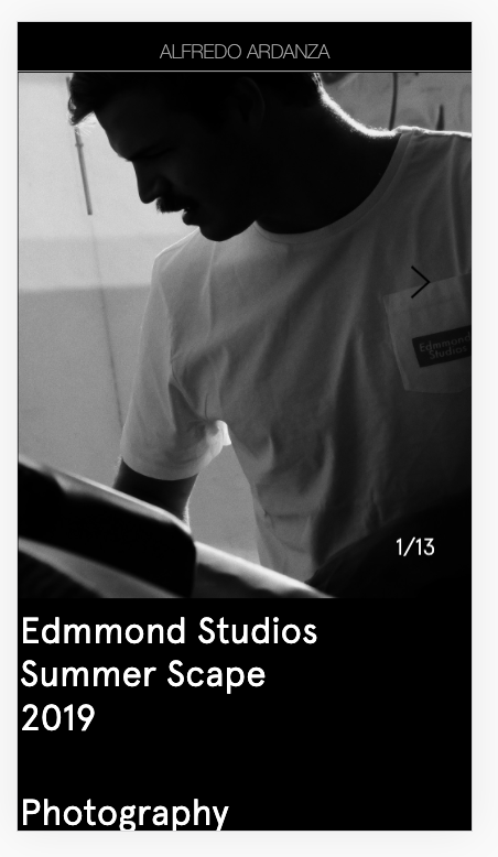
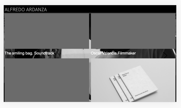
Link: http://alfredoardanza.com/edmmond-studios-s19-lookbook
It seems that also when the mobile is horizontal it takes the Full Screen Adon (for the desktop screen version I use it) that for the mobile version I have it disabled.
Is there any way to fix this?
Have a nice weekend :) -
Dear @fredyatb
The website will be displayed based on the Viewport width. So a calculation occurs where if the Browser width is less than say :600px it becomes the TABLET mode and when the browser width becomes less than say: 480px it become Mobile mode.
This isn't a bug exactly because the website is doing what it should and is displaying what should be displayed based on screen width.
Let me know your thoughts :)
Best wishes
Richard

Hello! It looks like you're interested in this conversation, but you don't have an account yet.
Getting fed up of having to scroll through the same posts each visit? When you register for an account, you'll always come back to exactly where you were before, and choose to be notified of new replies (either via email, or push notification). You'll also be able to save bookmarks and upvote posts to show your appreciation to other community members.
With your input, this post could be even better 💗
Register Login