help with mobile menu styling needed
-
How can I fill the space between the open mobile menu and where the menu bar is with black? I‘m using a transparent menu bar with mobile menu style 1 and lowered the position of the open menu using this code (which doesn’t work properly):
@media (max-width: 768px) {
.mobile-nav-wrap {
background-color: black !important;
}
.laynav.mobile-nav.mobile-menu-style-style_1.active {
top: 36px !important;
background-color: black !important;
}
}Essentially what I want is the black space to reach up and fill the site title and menu button space only when the mobile menu is open. Any ideas really appreciated!
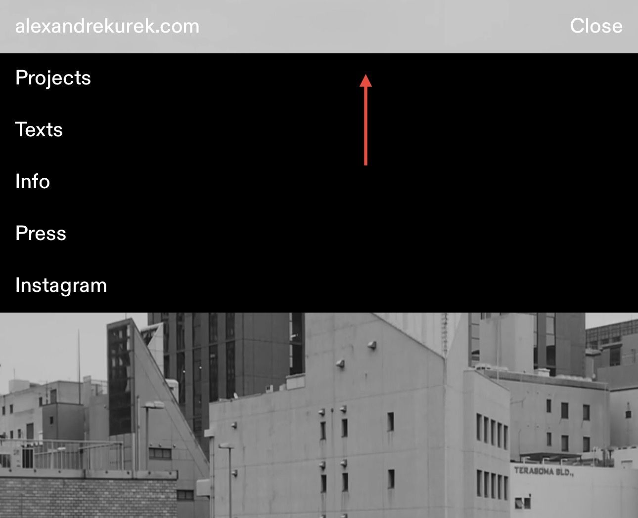
-
instead of top: 36px, do padding-top: 36px;
.laynav.mobile-nav.mobile-menu-style-style_1.active { padding-top: 36px !important; background-color: #000 !important; } -
-
im happy it works for you! no problem! sorry for the wait

Hello! It looks like you're interested in this conversation, but you don't have an account yet.
Getting fed up of having to scroll through the same posts each visit? When you register for an account, you'll always come back to exactly where you were before, and choose to be notified of new replies (either via email, or push notification). You'll also be able to save bookmarks and upvote posts to show your appreciation to other community members.
With your input, this post could be even better 💗
Register Login