caroussel on mobile
-
I’m running into an issue with my carousels.
On desktop, all slideshows are set to a height of 82vh. For mobile, I’m using unsynced slideshows because they have different captions.
On mobile, the images now appear much lower on the page, as if they’re still inheriting the 82vh height from the desktop version. You initially just see a blank (white) screen, and only after scrolling do the images appear.
It also seems like the aspect ratio of the first element is being calculated based on the desktop image. In the backend, I can see a heavily zoomed-in crop as well.
When I try to adjust the mobile carousel settings, it also affects the desktop version, as if they were synced. But this could not be because they still have different captions.
The website has been running fine for years, but this has now become a general issue across all projects, not just a single one.
https://vparch.ch/verwaltungsgebaeude-stampfenbachstrasse-30-zuerich/
-
ok i see now why this happens, working on it!
-
hey so i looked over this again and it seems like its a bug of an older lay theme version, and yours is 10.1.1
you just need to update lay theme and the carousel plugin and then it should work fine again
let me know if that worked
-
also,

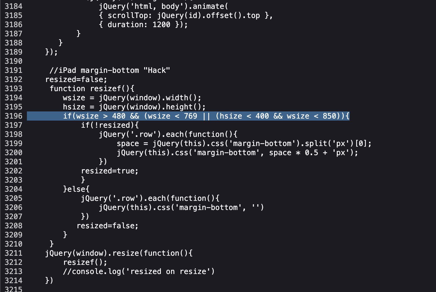
here is some malformed code?

Hello! It looks like you're interested in this conversation, but you don't have an account yet.
Getting fed up of having to scroll through the same posts each visit? When you register for an account, you'll always come back to exactly where you were before, and choose to be notified of new replies (either via email, or push notification). You'll also be able to save bookmarks and upvote posts to show your appreciation to other community members.
With your input, this post could be even better 💗
Register Login