Different scale between laptops

-
Hi all,
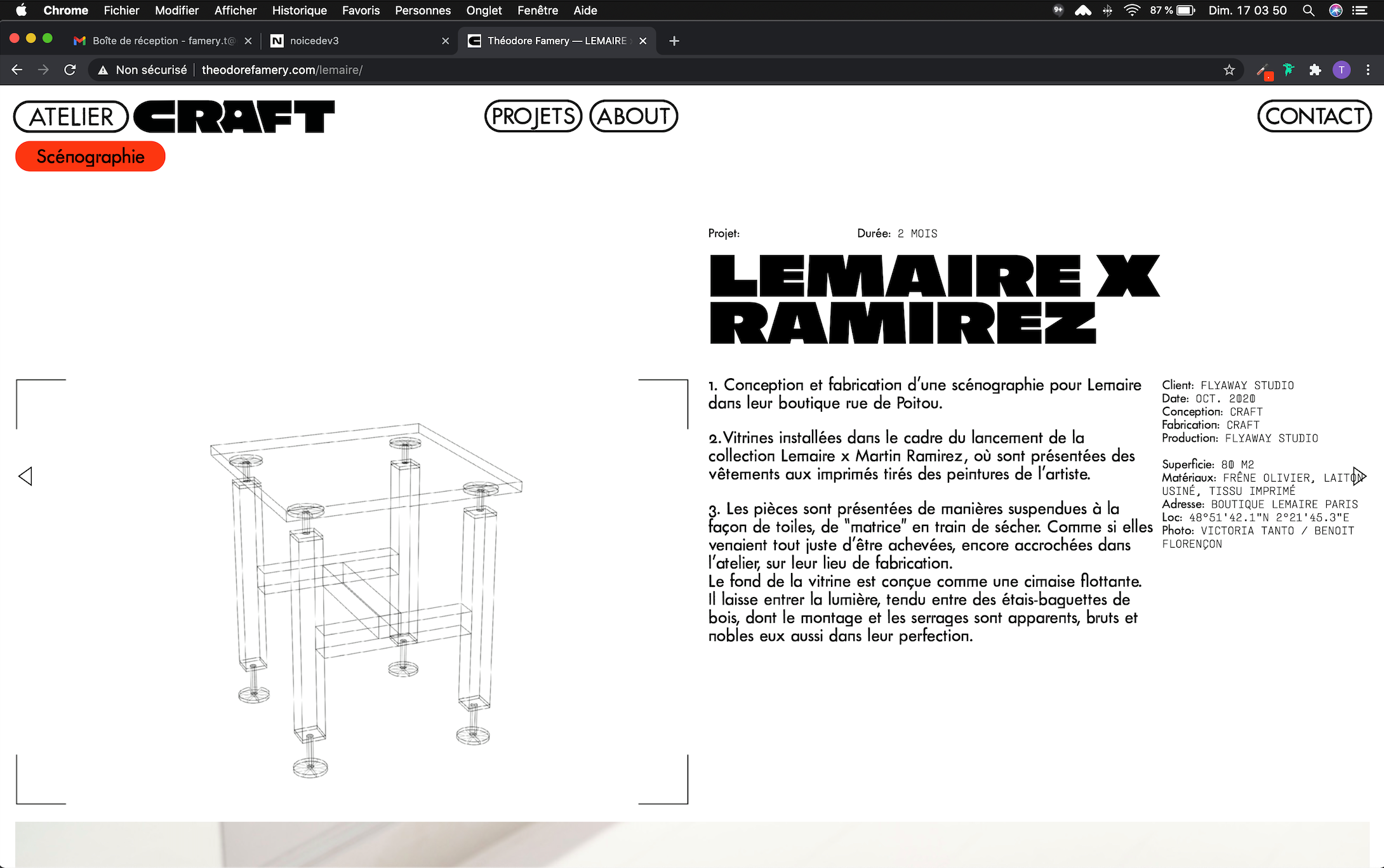
I have a resolution (or a responsive?) problem. My website doesn't have the same typographie and buttons size on different laptops.
- The first screenshot one from a MacBook Pro (13-inch, 2017) Google Chrome Version 86.0.4240.198

- The second one is from a MacBook Air (13-inch, 2011) Google Chrome Version 86.0.4240.80

- The third one from a MacBook Pro (15inch, 2016) Google Chrome 87.0.4280.88

The problem is mostly on the first screenshoot, but It's the most recent laptop, so it's quite anoying.
How can I fix it ?
Thanks
- The first screenshot one from a MacBook Pro (13-inch, 2017) Google Chrome Version 86.0.4240.198
-
Dear @EvaAnna
It could be to do with you using 'px' pixels for your 'font-size' settings, on different machines/screen this can be affected.
In text formats changing to a 'font-size: % ' may have some results:

Further you could force them with Custom CSS and set font-size: to 'em' or "rem'
https://www.w3schools.com/cssref/css_units.aspHope this helps @EvaAnna, website looks awesome BTW :)
Best
Richard

Hello! It looks like you're interested in this conversation, but you don't have an account yet.
Getting fed up of having to scroll through the same posts each visit? When you register for an account, you'll always come back to exactly where you were before, and choose to be notified of new replies (either via email, or push notification). You'll also be able to save bookmarks and upvote posts to show your appreciation to other community members.
With your input, this post could be even better 💗
Register Login