Menu + spaces between adapt to browser width
-
Hello there,
Thanks for this great Theme and for all your effort! Right now I am wondering how to make a responsive menu. I have four menu points (just words in the same typesize) and I want them to take the whole browser width, for all desktop/tablet browser sizes. That means the spaces between the menu points should change. Is there a way to implement this? Thanks a lot! -
Dear @PC
I see in the 'Customize' menu that only px are available atm..
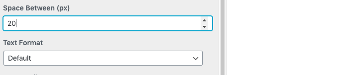
However you could target the menu adding CSS and then give the Menu a 'Viewport' margin OR 'VH' setting "viewheight"
The menu points will space themselves based on your browser's height:
https://css-tricks.com/fun-viewport-units/So in 'Lay-options - 'Custom CSS & HTML" you would add some code to the top section - 'Custom CSS'
Example:
.laynav .menu-item {
    margin-bottom:10vh !important;
}
Good Luck and let me know how you go! :)
Best Wishes
Richard -
-

Hello! It looks like you're interested in this conversation, but you don't have an account yet.
Getting fed up of having to scroll through the same posts each visit? When you register for an account, you'll always come back to exactly where you were before, and choose to be notified of new replies (either via email, or push notification). You'll also be able to save bookmarks and upvote posts to show your appreciation to other community members.
With your input, this post could be even better 💗
Register Login