image not adapting to layout when browser is more narrow
-
Hi there
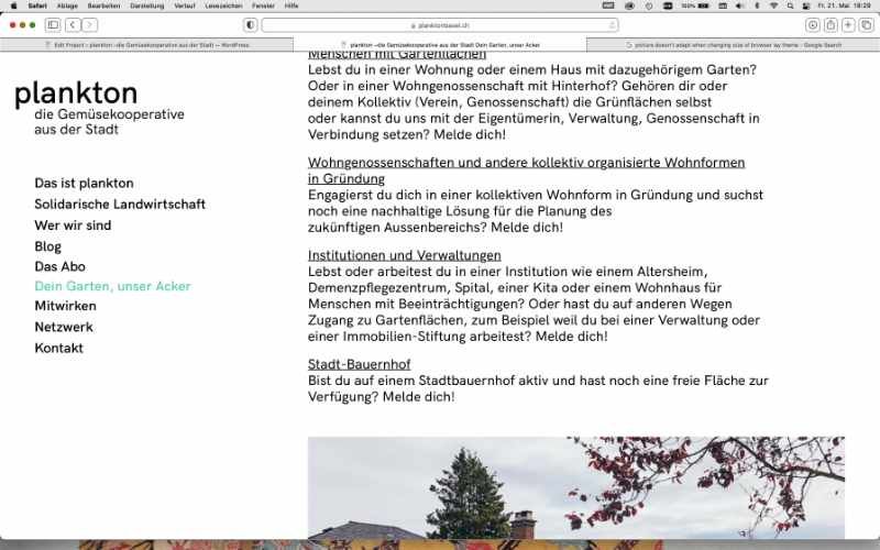
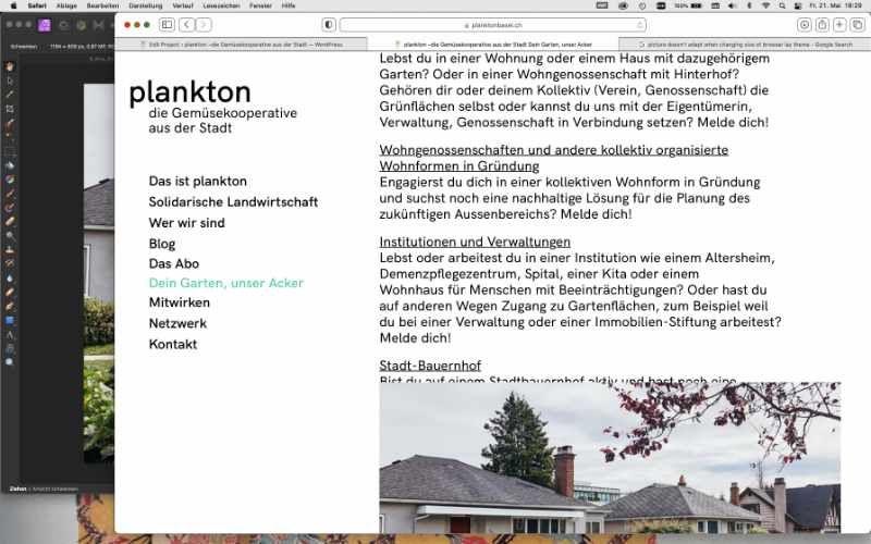
I couldn't find the right thread for my problem I have, so here a new topic: when I change the size of my browser window, one picture doesn't adapt with the layout and lies over the text which you can't read anymore. Attached some screenshots to make it more clear.
I already deleted and uploaded again the image but the problem still remains..
Any recommendations what to do?
Thanks beforehand, any help is very appreciated!Have a good evening,
Laurence
For paid 1-on-1 Lay Theme Coaching, contact Audrey (audrey@cyberslayers.work) or me (info@laytheme.com).
We also code custom websites or bespoke Lay features. Drop me a line at info@laytheme.com or check out my work at arminunruh.com.
Want to support my work? paypal.me/arminunruh
Before you post:
- When using a WordPress Cache plugin, disable it or clear your cache.
- Update Lay Theme and all Lay Theme Addons
- Disable all Plugins
- Go to Lay Options → Custom CSS & HTML, click "Turn Off All Custom Code", click "Save Changes"
This often solves issues you might run into
When you post:
- Post a link to where the problem is
- Does the problem happen on Chrome, Firefox, Safari or iPhone or Android?
- If the problem is difficult to explain, post screenshots / link to a video to explain it