Text content runs over col width in the phone layout
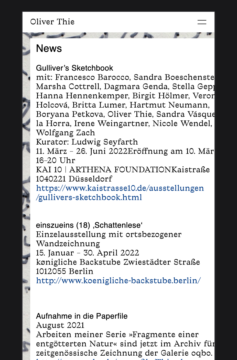

-
This post is deleted!
-
Dear @juliettakosmotak
The Container that holds the text is responsive. It's set in a percentage % and will shrink relative to the page ( actually to its parent container, which shrinks relative to the page )
The font-size you have set is in pixels (px).
This is a fixed unit and will always be 15px regardless of browser width.
I would suggest changing it to another unit e.g % within your Text format settings. This way it should move with your website.
Best
Richard
-
Hi Richard,
I fixed it with deleting any text formats with Indesign and put the plain text in the container again. And now its working.
But thanks for your suggestion! Maybe its good to work with % to avoid this in the future.
Best–
J -
Dear @juliettakosmotak
Thanks for the update and providing your solution, this helps others too 🌻
Have a wonderful day!
Richard

Hello! It looks like you're interested in this conversation, but you don't have an account yet.
Getting fed up of having to scroll through the same posts each visit? When you register for an account, you'll always come back to exactly where you were before, and choose to be notified of new replies (either via email, or push notification). You'll also be able to save bookmarks and upvote posts to show your appreciation to other community members.
With your input, this post could be even better 💗
Register Login