Skip to content
  • Recent
  • Tags
  • Popular
  • Users
  • Search
Skins
  • Light
  • Brite
  • Cerulean
  • Cosmo
  • Flatly
  • Journal
  • Litera
  • Lumen
  • Lux
  • Materia
  • Minty
  • Morph
  • Pulse
  • Sandstone
  • Simplex
  • Sketchy
  • Spacelab
  • United
  • Yeti
  • Zephyr
  • Dark
  • Cyborg
  • Darkly
  • Quartz
  • Slate
  • Solar
  • Superhero
  • Vapor

  • Default (No Skin)
  • No Skin
Collapse

Lay Theme Forum

  1. Home
  2. General Discussion
  3. Jquery media height

Jquery media height

Scheduled Pinned Locked Moved General Discussion
8 Posts 2 Posters 1.5k Views
  • Oldest to Newest
  • Newest to Oldest
  • Most Votes
Reply
  • Reply as topic
Log in to reply
This topic has been deleted. Only users with topic management privileges can see it.
  • E
    E
    evey_k
    wrote on last edited by
    #1

    Hi @Armin-Unruh @arminunruh,

    I have been trying to get help from colleagues of yours and somehow both of them are not able to help (never replied or attend to my problem constructively). I therefore asking you personally:

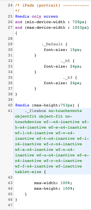
    My carousel height is making my layout break. I have tried the Jquery Media lines to fix the height but it is still not working and i have no idea what i've done wrong.

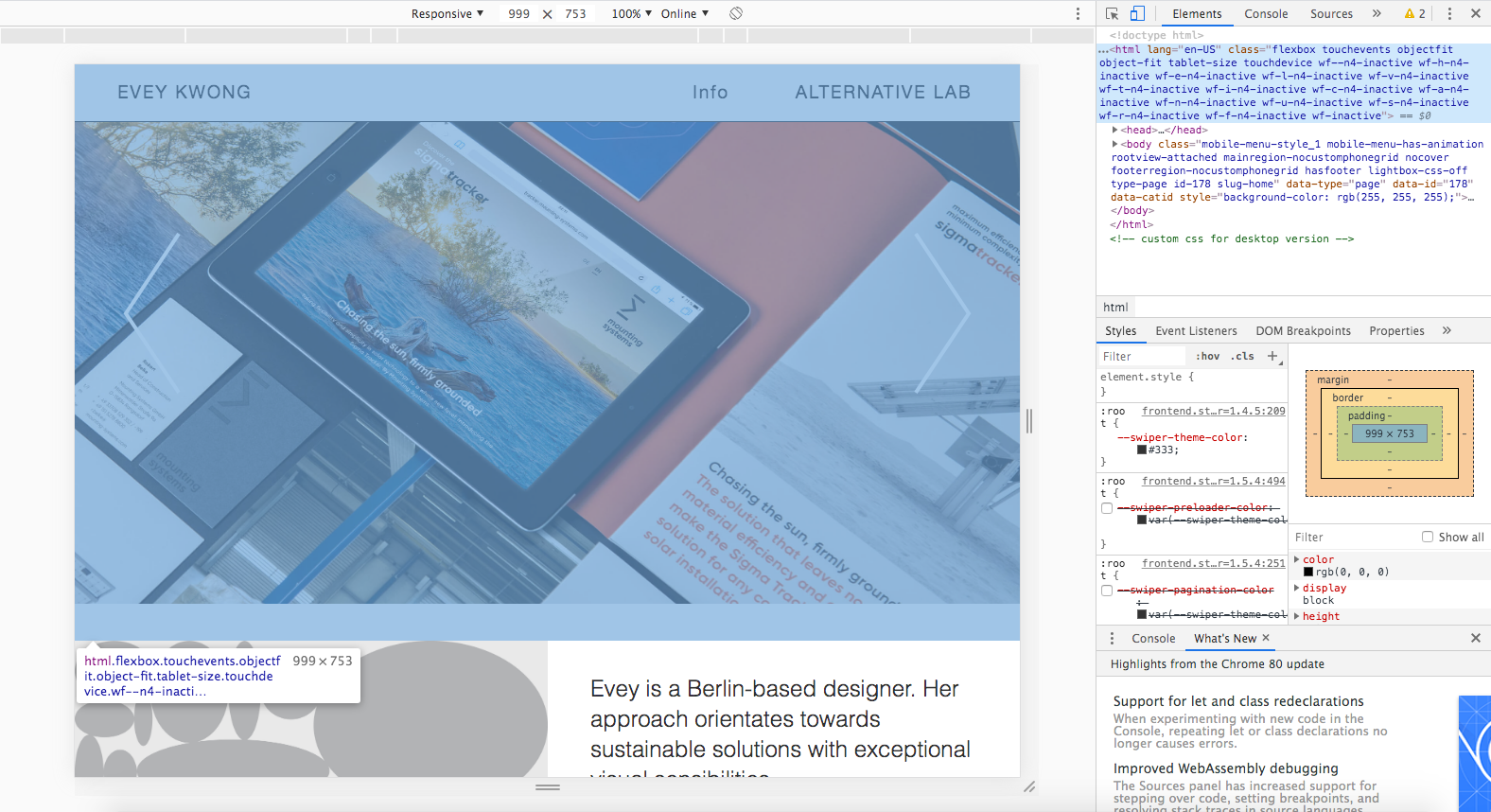
    On pic no.2 is my problem whereby between the carousel and the pic thumbnail has a gap. This only happens when i scale it down between 1053px-729px.
    On pic no.3 is when the UI is fine.

    I would really appreciate it if i could get finally a constructive feedback from you.

    Here is my website: https://eveykwong.com/

    Thank you!
    Screen Shot 2020-03-30 at 21.08.48.png Screen Shot 2020-03-30 at 21.08.19.png Screen Shot 2020-03-30 at 21.08.11.png Screen Shot 2020-03-30 at 21.05.59.png

    1 Reply Last reply
    0
    • E
      E
      evey_k
      wrote on last edited by evey_k
      #2

      On a side note:
      I have no idea / experience with JQuery. This is only my guess that the height needs to be fixed. fyi

      1 Reply Last reply
      0
      • mariusjopenM
        mariusjopenM
        mariusjopen
        Global Moderator
        wrote on last edited by
        #3

        Dear @evey_k
        the media queries is not the right approach. it only messes things up.
        I recommend to strip it down first. Get rid of all the extra code you do not use to style and solve this problem.
        Make a big carousel, place your thumbnails below.

        Once you got his, let us know again, and we can have a look. Right now it is quite a mess with those media queries.

        You will not need jQuery to do this.
        Just CSS in the right spot.

        Best!

        Marius

        www.mariusjopen.world

        1 Reply Last reply
        0
        • E
          E
          evey_k
          wrote on last edited by
          #4

          Hey @mariusjopen,

          Thanks for the feedback!
          i just removed the jqueries, the only css which are left for desktop is :
          .carousel-full {
          height: 100vh;
          }

          .lay-carousel.sliding {
          height: 100vh;
          }

          .col .lay-carousel img.h100 {
          object-fit: cover;
          height: 100vh;
          width: 100vw;
          }

          .flickity-viewport {
          height: 100vh;
          }

          For general CSS:
          button.flickity-prev-next-button.next {
          top: 54vh;
          }

          button.flickity-prev-next-button.previous {
          top: 54vh;
          }

          And mobile:
          button.flickity-prev-next-button.next {
          top: 22vh;
          }

          button.flickity-prev-next-button.previous {
          top: 22vh;
          }

          Other than the layout breaking apart, same thing is also affecting the left/right arrows when browsers are scaled.

          1 Reply Last reply
          0
          • mariusjopenM
            mariusjopenM
            mariusjopen
            Global Moderator
            wrote on last edited by
            #5

            Dear @evey_k
            I think that this works:

            .row.one-col-row {
                height: 100vh;
            }
            
            .row.one-col-row .lay-carousel-slide.lay-carousel-slide-img{
                height: 100vh;
            }
            

            Let me know!

            Marius

            www.mariusjopen.world

            1 Reply Last reply
            0
            • E
              E
              evey_k
              wrote on last edited by
              #6

              We are almost there... the layout doesn't break anymore. However, when browser scaled to iPhone size, the picture becomes fullscreen, which it shouldn't. Only the desktop and tablet should be on fullscreen. Is there a possibility to make an exception like this? (see pic A)

              B is the status quo

              B.png

              A.png

              1 Reply Last reply
              0
              • E
                E
                evey_k
                wrote on last edited by evey_k
                #7

                Sorry @mariusjopen I'm not sure if the solution you brought up solved the problem. My content pages with the spacing between text and images are also affected now when on tablet and phone scale (see screenshots)

                It looks to me that perhaps the ratio of the images / carousel needs to be fixed by the height regardless of mediums (iPhone/iPad/Desktop)

                Ok desktop version

                ok.png

                Not Ok desktop version
                not-ok.png

                Ok phone version
                phone_ok.png

                Not Ok phone version
                phone_not_ok.png

                1 Reply Last reply
                0
                • mariusjopenM
                  mariusjopenM
                  mariusjopen
                  Global Moderator
                  wrote on last edited by
                  #8

                  Dear @evey_k
                  yes. My solution was the first step into this direction.
                  We sadly cannot offer help in this big amount.
                  If you show this to a developer he should know what to do.
                  Or dig into it yourself.
                  Best!
                  Marius

                  www.mariusjopen.world

                  1 Reply Last reply
                  0

                  Hello! It looks like you're interested in this conversation, but you don't have an account yet.

                  Getting fed up of having to scroll through the same posts each visit? When you register for an account, you'll always come back to exactly where you were before, and choose to be notified of new replies (either via email, or push notification). You'll also be able to save bookmarks and upvote posts to show your appreciation to other community members.

                  With your input, this post could be even better 💗

                  Register Login
                  Reply
                  • Reply as topic
                  Log in to reply
                  • Oldest to Newest
                  • Newest to Oldest
                  • Most Votes


                  Online Users
                  I
                  itsbadjujuju
                  Forgot your key, lost your files, need a previous Lay Theme or Addon version? Go to www.laykeymanager.com
                  laytheme.com
                  • Login

                  • Don't have an account? Register

                  • Login or register to search.
                  • First post
                    Last post
                  0
                  • Recent
                  • Tags
                  • Popular
                  • Users
                  • Search