menu mobile horizontal
-
hi!
this is my site im working on: http://post.mikeabmaier.com
on my phone / tablet the site looks good but when i flip my phone to horizontal the "desktop-menu" appears (and unfortunately its too long and is behind my logo...)
is it poosible to have the "mobile menu" also in horizontal?thx!!! :)
-
Dear @dingdong
did you play around with the breakpoints?
Yes… This is a topic all developers have to face :-(
#notfun
Best!
Marius -
I am going through the same situation. @arminunruh, would be possible to disable the "flip horizontal" for the mobile version?
-
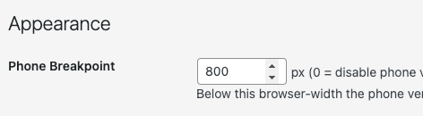
i cant disable that
just in lay options - set the breakpoint so sth bigger:
For paid 1-on-1 Lay Theme Coaching, contact Audrey (audrey@cyberslayers.work) or me (info@laytheme.com).
We also code custom websites or bespoke Lay features. Drop me a line at info@laytheme.com or check out my work at arminunruh.com.
Want to support my work? paypal.me/arminunruh
Before you post:
- When using a WordPress Cache plugin, disable it or clear your cache.
- Update Lay Theme and all Lay Theme Addons
- Disable all Plugins
- Go to Lay Options → Custom CSS & HTML, click "Turn Off All Custom Code", click "Save Changes"
This often solves issues you might run into
When you post:
- Post a link to where the problem is
- Does the problem happen on Chrome, Firefox, Safari or iPhone or Android?
- If the problem is difficult to explain, post screenshots / link to a video to explain it