fixed sized square video
-
hello all - total beginner in css, so excuse my cluelesness.
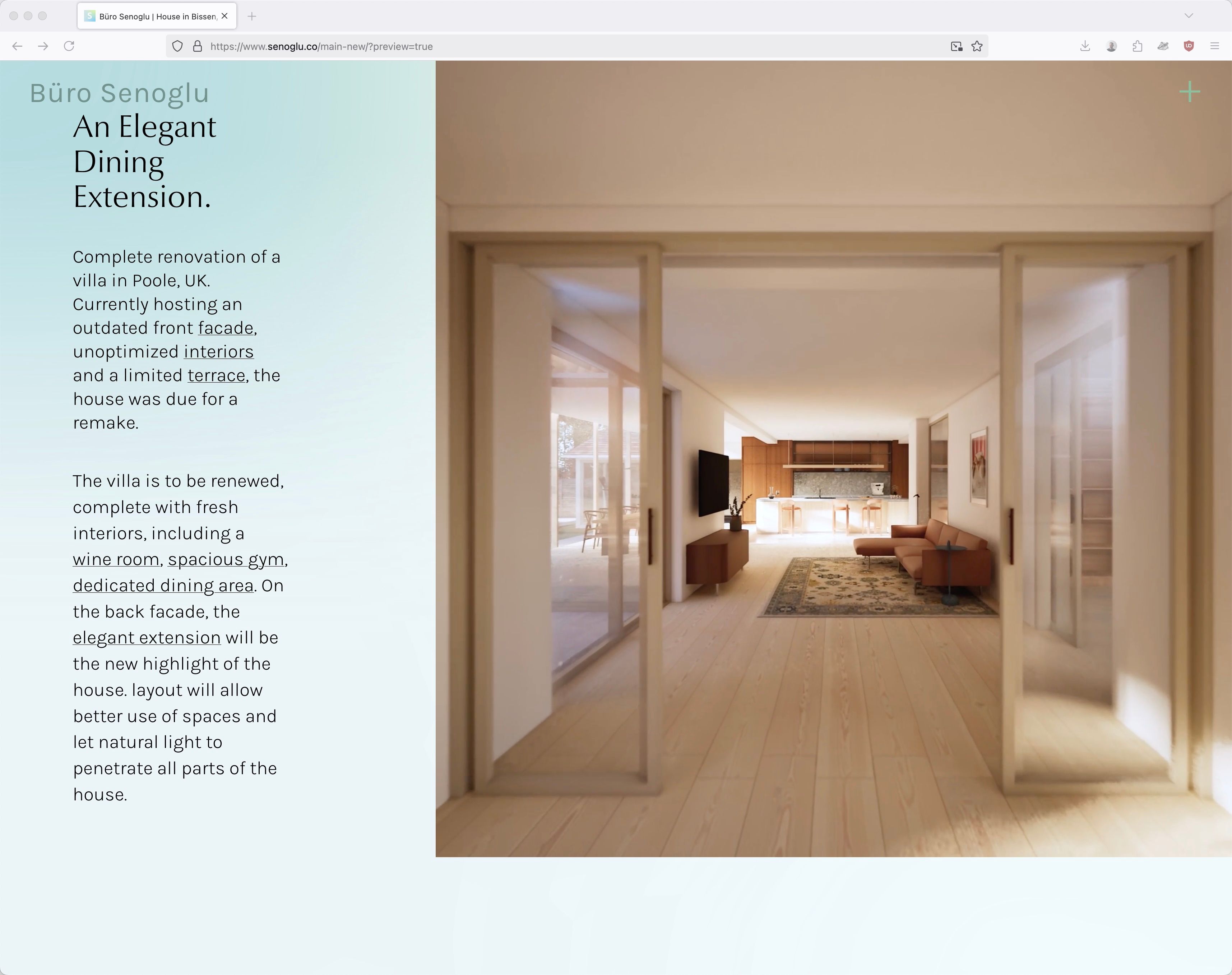
i'm trying to make a video stick to the right side of the page, and to have it dictate the rest of the elements on the page without changing aspect ratio or cropping. meaning that i don't want to see any padding beneath the video when the page is resized, or have the video cut. ideally the aspect ratio would always stay 1:1 and the video would get smaller if the page is of an odd shape. is this possible?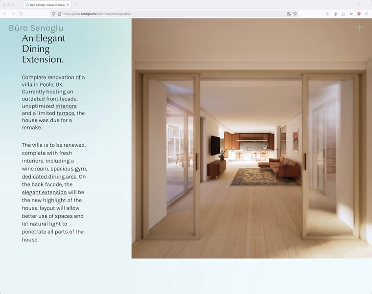
-
what would happen if your browser window is also square? there would be no space left for the text, right?
-
Either that or the text could overlap the video.
-
you could try "set browser height for row height" for this row in the gridder and then give the video a class and make it "height: 100vh" with custom css for starters.
-
thanks felix, i will try this.
-
i've done as you said i believe, however it doesn't work as intended. can you spot what i'm not doing correct? here's a screen capture:
-
@emresenoglu try to use that for your custom video class:
position: absolute;
top: 0;
right: 0;
width: auto;
height: 100vh;
aspect-ratio: 1;But you have to reflect if this is the best approach webdesign-wise, also considering mobile and tablet layouts.
-
do you have a link please?
-
right click your row, choose "use browser height for row height"
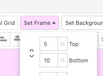
for top frame and bottom frame use: 0
now select your video in your grid, make sure it is aligned
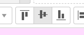
to middle
and make sure to use a square video.
this way you dont need to use css.

Hello! It looks like you're interested in this conversation, but you don't have an account yet.
Getting fed up of having to scroll through the same posts each visit? When you register for an account, you'll always come back to exactly where you were before, and choose to be notified of new replies (either via email, or push notification). You'll also be able to save bookmarks and upvote posts to show your appreciation to other community members.
With your input, this post could be even better 💗
Register Login