How to set Row Image Background to 100% width on mobile?
-
I’m trying to set a row image background to 100% width on mobile (excluding the default padding).
Specifically, this is for the white transparent image in the footer of the following website.
The red area is also a square image, but it’s not displaying as a square on mobile either. I’ve tried various solutions using CSS and even JavaScript, but I’m still struggling to get it right. I might be doing something wrong, so any help or guidance would be greatly appreciated.
Thanks in advance!
-
@MWPA not quite sure I am understanding your problem, because I think you mean 100% height? you could make a custom phone layout for your footer to get rid of the default padding above and below the footer area.
for the red square: you could give the area a red background color instead of an image and give it a custom mobile css class that has an aspect-ratio of 1/1.
-
@felix_rabe: Thanks for your quick reply. I fixed what I needed, but now there seems to be a bug with the two-column layout. See attachments.
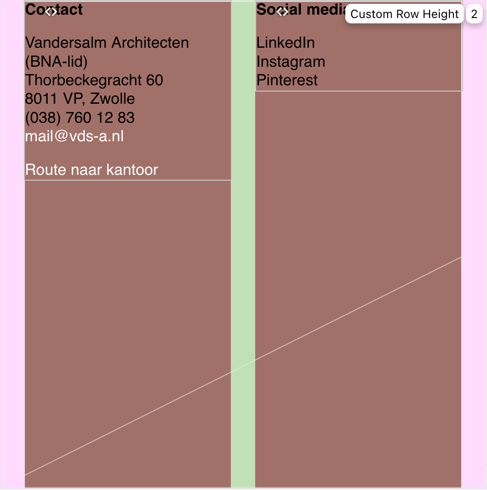
Screenshot backend
Screenshot frontendIf I only use the second column, then there is no problem. See the additional text below (on mobile):
Social media
LinkedIn
Instagram
PinterestI don't understand this.
URL website:
https://dev.rickangenent.nl/ -
oh
sorry about the late response!
i found out why it doesnt work! im releasing the fix now, if u update it should work
-
actually give me a few minutes, i will release the update later today
-

Hello! It looks like you're interested in this conversation, but you don't have an account yet.
Getting fed up of having to scroll through the same posts each visit? When you register for an account, you'll always come back to exactly where you were before, and choose to be notified of new replies (either via email, or push notification). You'll also be able to save bookmarks and upvote posts to show your appreciation to other community members.
With your input, this post could be even better 💗
Register Login