Mobile Homepage wider than browser window and background video is not autoplaying?
-
The homepage I'm making at the moment (https://2025-website.er-sc.com/) has a thumbnail grid, but the width of the homepage in the mobile version is wider than the browser window. How can I avoid this?
Also, I put a video at the top, which is not autoplaying as it should, also in the mobile version. Any ideas how to solve this?
Thanks!
-
great looking website!!
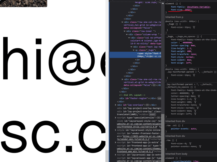
it seems to be this text, that has a large font-size applied to it.
please go to where this text is in the gridder, and edit it.
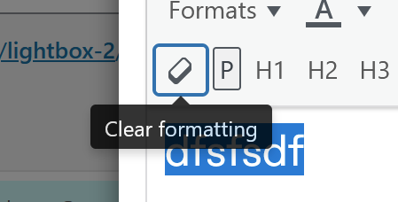
select the text and click "clear formatting"
now apply a textformat, that has a smaller font-size for mobile.
my guess is you want your email address to be full width.
you could create a svg and insert it as a 100% full width image instead of using text. this would scale it perfectly.btw for this you could also use the new table element:
For paid 1-on-1 Lay Theme Coaching, contact Audrey (audrey@cyberslayers.work) or me (info@laytheme.com).
We also code custom websites or bespoke Lay features. Drop me a line at info@laytheme.com or check out my work at arminunruh.com.
Want to support my work? paypal.me/arminunruh
Before you post:
- When using a WordPress Cache plugin, disable it or clear your cache.
- Update Lay Theme and all Lay Theme Addons
- Disable all Plugins
- Go to Lay Options → Custom CSS & HTML, click "Turn Off All Custom Code", click "Save Changes"
This often solves issues you might run into
When you post:
- Post a link to where the problem is
- Does the problem happen on Chrome, Firefox, Safari or iPhone or Android?
- If the problem is difficult to explain, post screenshots / link to a video to explain it