image centered / resized on all screens
-
Hi everyone,
How do I get a single image horizontally and vertically centered and proportional scaled, so it doesn´t get cropped, no matter the screen or image format?
The images are displayed on single project pages.
(For example: https://sylviagoebel.de/paredus/)I tried to activate „Use browser height for row height“ and restrict the image through a class and max-width / max-height. But this doesn´t effect the image.
I´m struggling to find a solution and hope someone can help.
Best, jonas
-
create a row, right click the row and choose "use browser height for row height"
insert an image.
right click the image, click "set html class and id"
use a class like:fluidimage
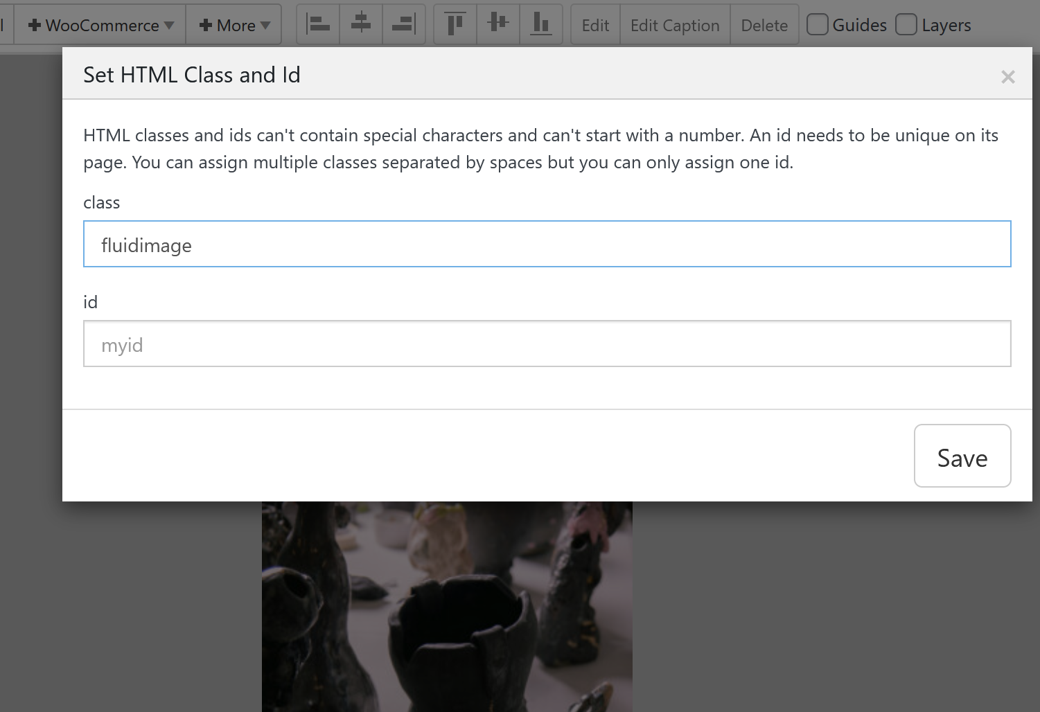
add this in:
lay options -> custom css & html -> custom css for desktop.fluidimage{ position: absolute!important; top: 5vh!important; left: 5vw!important; } .fluidimage .ph{ display: none; } .fluidimage img{ width: 90vw!important; height: 90vh!important; object-fit: contain!important; } -
Great, this works. Thanks a lot, Armin!
-
hey jonas!
with the latest lay theme update you can also do this:position an image over the whole full width:
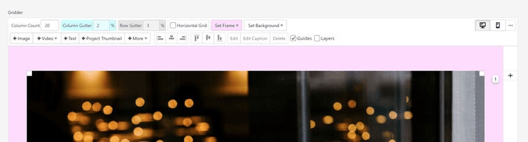
select the image and in the sidebar, enable fixed height and use object fit contain.
play around with the height setting, you could also use a value like 90vh for example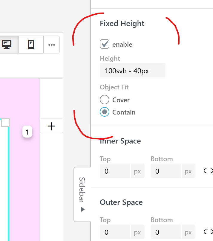

Hello! It looks like you're interested in this conversation, but you don't have an account yet.
Getting fed up of having to scroll through the same posts each visit? When you register for an account, you'll always come back to exactly where you were before, and choose to be notified of new replies (either via email, or push notification). You'll also be able to save bookmarks and upvote posts to show your appreciation to other community members.
With your input, this post could be even better 💗
Register Login