Skip to content
  • Recent
  • Tags
  • Popular
  • Users
  • Search
Skins
  • Light
  • Brite
  • Cerulean
  • Cosmo
  • Flatly
  • Journal
  • Litera
  • Lumen
  • Lux
  • Materia
  • Minty
  • Morph
  • Pulse
  • Sandstone
  • Simplex
  • Sketchy
  • Spacelab
  • United
  • Yeti
  • Zephyr
  • Dark
  • Cyborg
  • Darkly
  • Quartz
  • Slate
  • Solar
  • Superhero
  • Vapor

  • Default (No Skin)
  • No Skin
Collapse

Lay Theme Forum

  1. Home
  2. General Discussion
  3. mobile menu Style 1 - dark transparent background

mobile menu Style 1 - dark transparent background

Scheduled Pinned Locked Moved General Discussion
3 Posts 2 Posters 28 Views 1 Watching
  • Oldest to Newest
  • Newest to Oldest
  • Most Votes
Reply
  • Reply as topic
Log in to reply
This topic has been deleted. Only users with topic management privileges can see it.
  • N Offline
    N Offline
    Nzagamba
    wrote last edited by
    #1

    I would like to darken the background of the website, when my mobile menu style 1, drops down.
    The css rule of the background could be something like the bellow, but I couldn't figure out to what class or div I need to point this css to:

    /* Transparent full-page overlay behind the menu */
    .menu-overlay { /* what is the correct class???  */
      position: fixed;
      inset: 0;
      background: rgba(0, 0, 0, 0.5); 
      opacity: 0;
      transition: opacity 0.25s ease;
      z-index: 1000;
    

    IMG_6408.jpg

    1 Reply Last reply
    0
    • arminunruhA Offline
      arminunruhA Offline
      arminunruh
      Global Moderator
      wrote last edited by
      #2

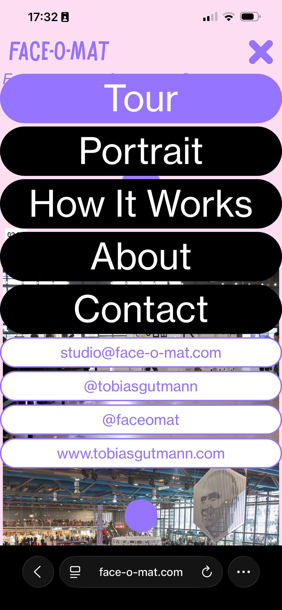
      well the container of your mobile nav does not span the whole page

      image.png

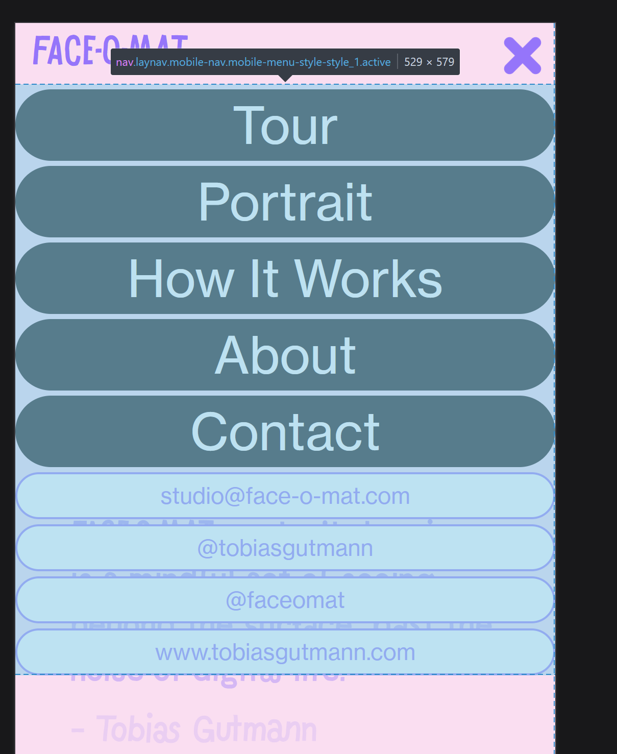
      otherwise you could just style the background of it

      the body has a class "mobile-menu-open"

      image.png

      so you could use that

      1 Reply Last reply
      0
      • arminunruhA Offline
        arminunruhA Offline
        arminunruh
        Global Moderator
        wrote last edited by
        #3

        i would just use

        .mobile-menu-open .lay-content,
        .mobile-menu-open .navbar,
        .mobile-menu-open .mobile-title,
        .mobile-menu-open .lay-mobile-icons-wrap{
        filter: brightness(50%);
        }

        1 Reply Last reply
        0
        Reply
        • Reply as topic
        Log in to reply
        • Oldest to Newest
        • Newest to Oldest
        • Most Votes


        I also code custom websites or custom Lay features.
        šŸ’æ Email me here: šŸ’æ
        info@laytheme.com

        Our Web Development company: 100k.studio

        Want to tip me? https://www.paypal.com/paypalme/arminunruh

        Before you post:
        1. When using a WordPress Cache plugin, disable it or clear your cache.
        2. Update Lay Theme and all Lay Theme Addons
        3. Disable all Plugins
        4. Go to Lay Options → Custom CSS & HTML, click "Turn Off All Custom Code", click "Save Changes"

        This often solves issues you might run into

        When you post:
        1. Post a link to where the problem is
        2. Does the problem happen on Chrome, Firefox, Safari or iPhone or Android?
        3. If the problem is difficult to explain, post screenshots / link to a video to explain it
        Online Users
        Forgot your key, lost your files, need a previous Lay Theme or Addon version? Go to www.laykeymanager.com
        laytheme.com
        • Login

        • Don't have an account? Register

        • Login or register to search.
        • First post
          Last post
        0
        • Recent
        • Tags
        • Popular
        • Users
        • Search