Different background images per row – responsive scaling
-
Dear Laytheme Forum,
I would like to use different background images for different rows on a page of my website.
The idea: I commissioned a designer to create a frame that looks like a floor plan of an apartment, where each row represents a different “room.”
The issue I’m facing is that the background images are not displayed correctly — parts of the “walls” get cut off when I set them as backgrounds.
I’m looking for a solution (maybe with using CSS) where:
the background image fully covers the entire row (top, bottom, left, and right),
nothing important gets cut off,
and the image scales proportionally depending on the browser size (responsive behavior).You can see my page here:
http://www.ar-mut.ch/startThis is what one of the images looks like:
https://ar-mut.ch/wp-content/uploads/2026/03/Ar.Mut_HP_1024x768_v02_s06.pngDoes anyone have an idea how to achieve this properly?
Thanks a lot and best regards,
Dennis -
hey dennis!
can you post a picture of the design here, so i can see what the end goal is?
i can certainly make this happen, i just need to see the big picture
-
currently you can insert a image, use fixed height, and object position contain and make sure the images' width goes over the full layout width and then make sure height is set to 100svh:
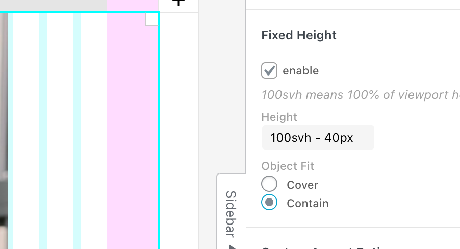
but i think thats not sufficient for what you need
-
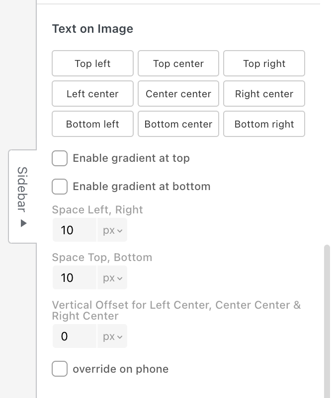
actually since the texts you want to have on the frame need to position themselves with the image when the browser sizes i changing, have you ever though about this:
just insert the frame as a normal image, then in the sidebar, use the "text on image" feature:
-
hey dennis!
can you post a picture of the design here, so i can see what the end goal is?
i can certainly make this happen, i just need to see the big picture
@arminunruh sure. Something like this: https://ar-mut.ch/wp-content/uploads/2026/03/Bildschirmfoto-2026-03-25-um-14.56.19.jpg
or like this:
https://ar-mut.ch/wp-content/uploads/2026/03/Bildschirmfoto-2026-03-25-um-14.57.33.jpg
Here a worktest, where you see my problem: https://ar-mut.ch/start-test/
-
ok i see, please try this:
remove the empty rows from your layout,
dont use custom row height or browser height on your rowinstead, click on an empty part of the row, then enter values for row padding top and row padding bottom (here i chose 50px, 50px as u see in the screenshot below), choose the row background image, and then choose object fit: fill, like here:
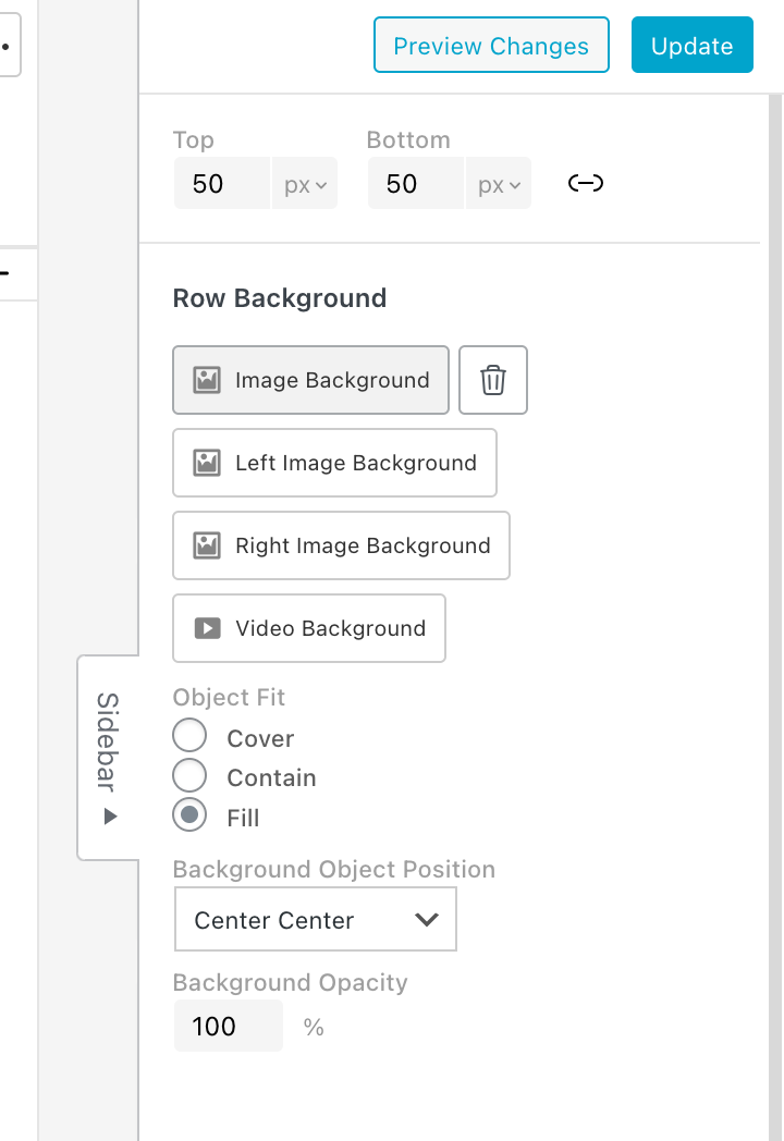
object fit: fill will only be available with the next update
this will stretch your image to be a perfect frame around the row
-
maybe today or tomorrow. i ended up calling it "stretch" instead of fill just to let u know
For paid 1-on-1 Lay Theme Coaching, contact Audrey (audrey@cyberslayers.work) or me (info@laytheme.com).
We also code custom websites or bespoke Lay features. Drop me a line at info@laytheme.com or check out my work at arminunruh.com.
Want to support my work? paypal.me/arminunruh
Before you post:
- When using a WordPress Cache plugin, disable it or clear your cache.
- Update Lay Theme and all Lay Theme Addons
- Disable all Plugins
- Go to Lay Options → Custom CSS & HTML, click "Turn Off All Custom Code", click "Save Changes"
This often solves issues you might run into
When you post:
- Post a link to where the problem is
- Does the problem happen on Chrome, Firefox, Safari or iPhone or Android?
- If the problem is difficult to explain, post screenshots / link to a video to explain it