How to make responsive nav bar
General Discussion
4
Posts
2
Posters
474
Views
1
Watching
-
Hi 3.14!
Can you post a link to your website? Then I can have a closer look.
Thank you :-)
Marius
-
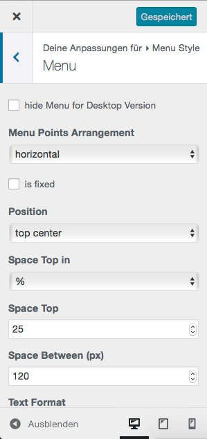
I trying to manage it that the menu bar has responsive width when resizing the browser window, till it turn into to mobile menu. In the same time
also so width as the column .Now the space between are set with the customize
this is the site beateneumann.com
thank you too
π.
For paid 1-on-1 Lay Theme Coaching, contact Audrey (audrey@cyberslayers.work) or me (info@laytheme.com).
We also code custom websites or bespoke Lay features. Drop me a line at info@laytheme.com or check out my work at arminunruh.com.
Want to support my work? paypal.me/arminunruh
Before you post:
- When using a WordPress Cache plugin, disable it or clear your cache.
- Update Lay Theme and all Lay Theme Addons
- Disable all Plugins
- Go to Lay Options → Custom CSS & HTML, click "Turn Off All Custom Code", click "Save Changes"
This often solves issues you might run into
When you post:
- Post a link to where the problem is
- Does the problem happen on Chrome, Firefox, Safari or iPhone or Android?
- If the problem is difficult to explain, post screenshots / link to a video to explain it
Online Users
Forgot your key, lost your files, need a previous Lay Theme or Addon version?
Go to www.laykeymanager.com