several styling issues with mobile and desktop menu
-
ok next version will include:
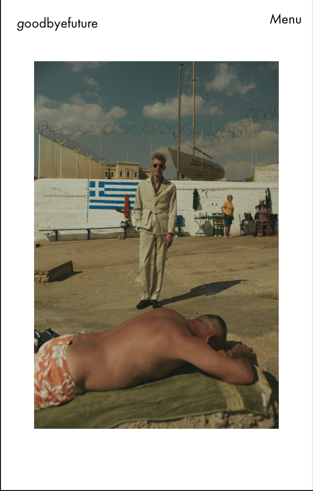
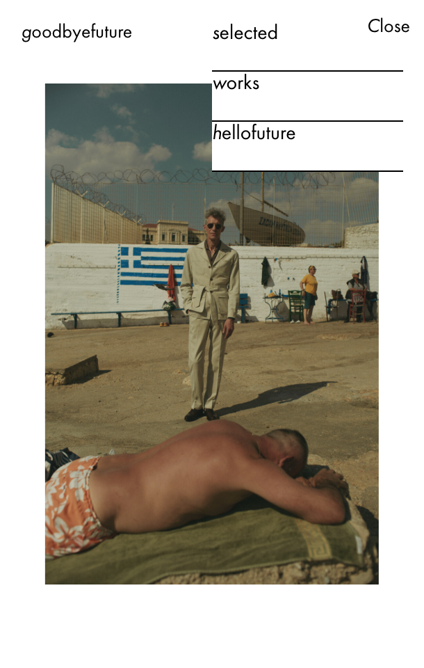
Second issue: Menu styling and position. I am using menu style 1. I use the word menu instead of a burger icon. I want the word to be on the same horizontal line as the site title and to align left at 50% width. When it drops down, I want the word menu to appear like the first menu item and to have a vertical spacing between them that looks consistent with the words menu. I know I can’t do that with just the customizer, obviously. How should I approach this?
can u do a quick sketch for me? not sure if i understand correctly
-
-
-
»Close«/»Menu« should sit at the same vertical line as the menu points and the same horizontal line as the site title. It should also sit in the same kind of box as the menu points with equal spacing etc.
-
ok can you send me the link i cant see it here https://goodbyefuture.com/
-
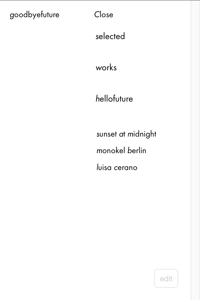
I’ve updated the site. You should be able to see it now. It currently looks like this, I’ve removed the lines:
-
This post is deleted!
-
This post is deleted!
-
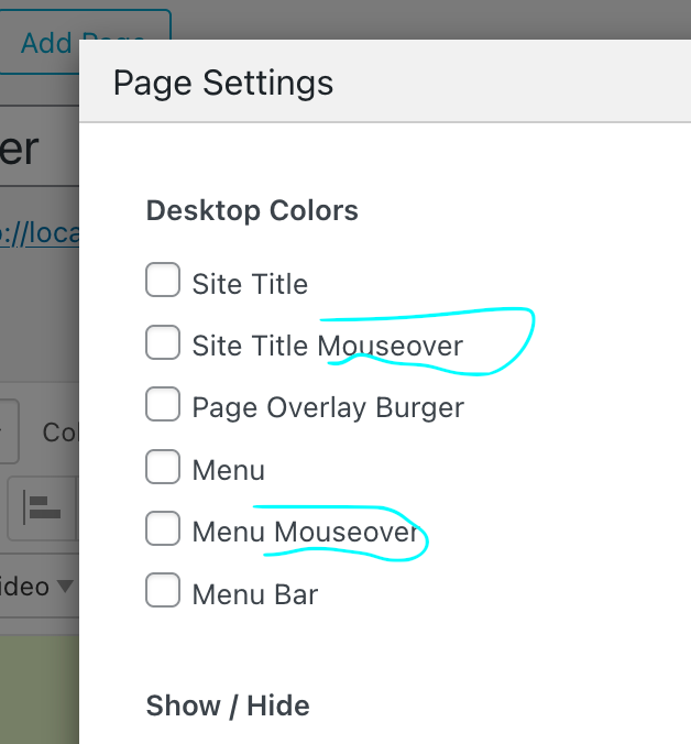
ok i took a look, and you could just use this no?
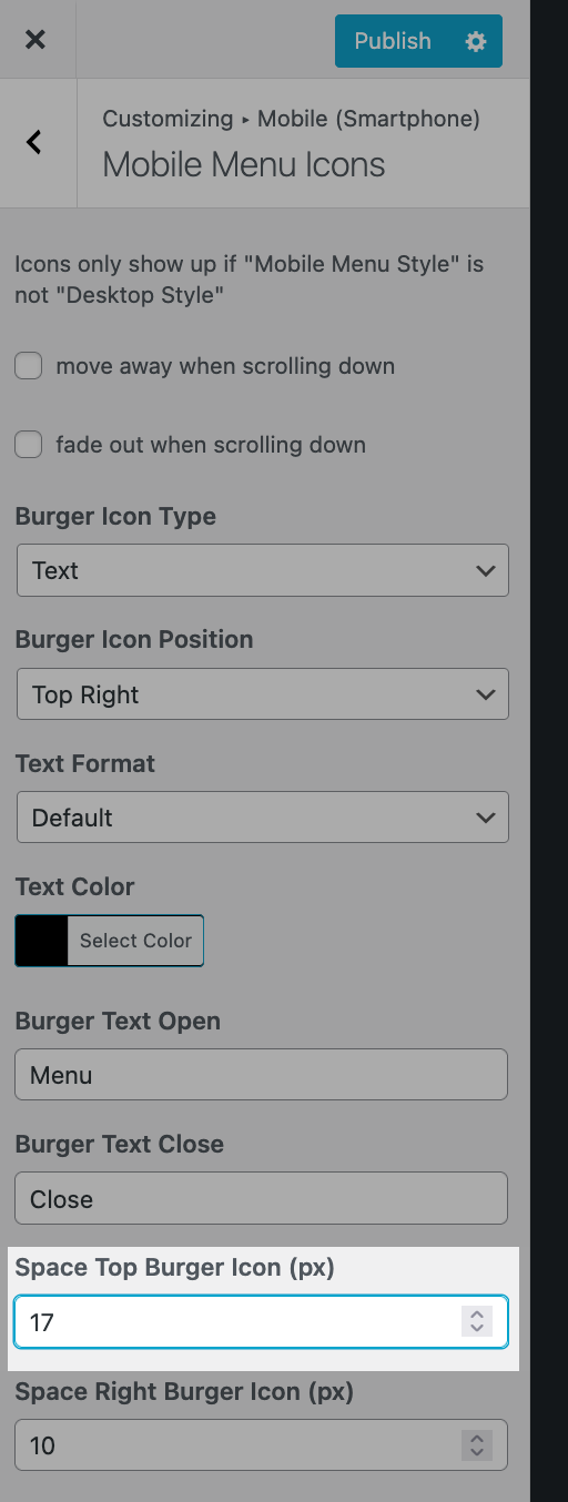
if u just use the same value here:
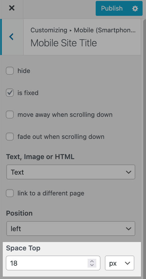
-
on your site ure using 5% for the site title Space Top
and 14px for the menu icon Space Top it seems

Hello! It looks like you're interested in this conversation, but you don't have an account yet.
Getting fed up of having to scroll through the same posts each visit? When you register for an account, you'll always come back to exactly where you were before, and choose to be notified of new replies (either via email, or push notification). You'll also be able to save bookmarks and upvote posts to show your appreciation to other community members.
With your input, this post could be even better 💗
Register Login