Custom Gridder-width, for different pages
-
Hy Everyone,
I'm in the process of creating a website that has a split screen so i can scroll seperately as seen at https://www.eliashanzer.com/ for example.
I already managed to put the footer next to the gridder like this:
.footer{
float: left;
width: 50%;
background: blue;
height: 100%;
overflow: scroll;
height: 100vh;
}
.grid{
float: left;
width: 50%;
background: red;
height: 100%;
overflow: scroll;
height: 100vh;
}
but the two question i have are:
1.
i dont want the gridder to be 50% on every page of the website.
is this possible and if yes how?2.
if I want the split screen elements to be under each other for the mobile version, do i simply move my custom css to »Custom CSS for Desktop Version« -
Dear @Henning
Q 1:
"i dont want the gridder to be 50% on every page of the website.
is this possible and if yes how?"A: Yes :)
Every page has its own set of attributes that we can use to target it specifically. So we can set up the CSS so that it only applies to the page you desire. Using the 'Inspect' tool within google Chrome i can look at the structure of a webpage ( right-click on page ) :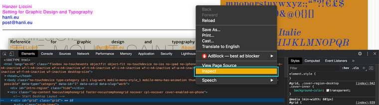
And up the top of the structure in the opening <body> tag i can see some important information:

A class called:
.slug-workAnd a data slug called:
[data-slug="work"]These are unique attributes to this page which we can use, so for example you could:
.slug-work .grid{
float: left;
width: 50%;
background: blue;
height: 100%;
overflow: scroll;
height: 100vh;
}
Etc :)
Q 2:
"if I want the split screen elements to be under each other for the mobile version, do i simply move my custom css to »Custom CSS for Desktop Version"
A: Yes
You could go about this customisation by only applying it to the Desktop Version's Custom CSS and then the Mobile would remain standardI hope this helps and best wishes, have a wonderful day
Richard :)

Hello! It looks like you're interested in this conversation, but you don't have an account yet.
Getting fed up of having to scroll through the same posts each visit? When you register for an account, you'll always come back to exactly where you were before, and choose to be notified of new replies (either via email, or push notification). You'll also be able to save bookmarks and upvote posts to show your appreciation to other community members.
With your input, this post could be even better 💗
Register Login