Change break point between mobile and desktop navigation
-
Hi!
Is there a simple way to change the break point between mobile and desktop navigation? I want the mobile navigation to stay visible until 1080px, and the desktop should be visible from 1081px up. (because otherwise the navigation is overlapping with the logo)with the desktop navi it works:
@media (max-width: 1081px) {
.desktop-nav {
display: none !important;
}
}but if I leave mobile visible longer than 600px, it looks completely messed up:
@media (min-width: 600px) {
nav.mobile-nav {
display: inherit;
}
}It would be great to have a) some help for this with CSS, or even better b) a setting in the Admin panel where I can define the point. That would be awesome!
Cheers, dabu
-
hey so you can only set the mobile breakpoint. but this will also cause the mobile version to show up, for example a custom phone layout or the content would just be stacked
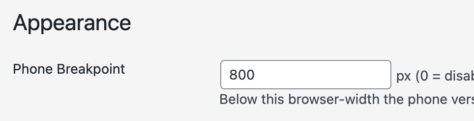
in lay options, appearance section
-
hey so you can only set the mobile breakpoint. but this will also cause the mobile version to show up, for example a custom phone layout or the content would just be stacked
in lay options, appearance section
@arminunruh Ok thanks I saw that. But as you mentioned, it will cause the mobile version to show up, which is not what I want. Anyway, I will try further…

Hello! It looks like you're interested in this conversation, but you don't have an account yet.
Getting fed up of having to scroll through the same posts each visit? When you register for an account, you'll always come back to exactly where you were before, and choose to be notified of new replies (either via email, or push notification). You'll also be able to save bookmarks and upvote posts to show your appreciation to other community members.
With your input, this post could be even better 💗
Register Login