project thumbnail grid in masonry layout is getting distorted
-
Hello,
I have a problem with my homepage where the project thumbnail grid in masonry layout is getting distorted: www.patrickslesiona.de I suspect that the issue may be related to the video. Is this problem already known and are there any suggestions on how to fix it?
Thank you!
Best regards
Patrick -
there seem to be empty spots and in the markup i see: simple-translate-light-theme divs

can you for example go to the "movimento" project, then go to the project description text box
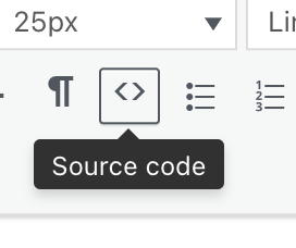
click the <> source code button and remove the html that says:
width: 600px; height: 800px; top: 0px; left: 0px; font-size: 13px;repeat for the other projects where you see the big gaps underneath
-
Thanks a lot! That was the solution.

Hello! It looks like you're interested in this conversation, but you don't have an account yet.
Getting fed up of having to scroll through the same posts each visit? When you register for an account, you'll always come back to exactly where you were before, and choose to be notified of new replies (either via email, or push notification). You'll also be able to save bookmarks and upvote posts to show your appreciation to other community members.
With your input, this post could be even better 💗
Register Login