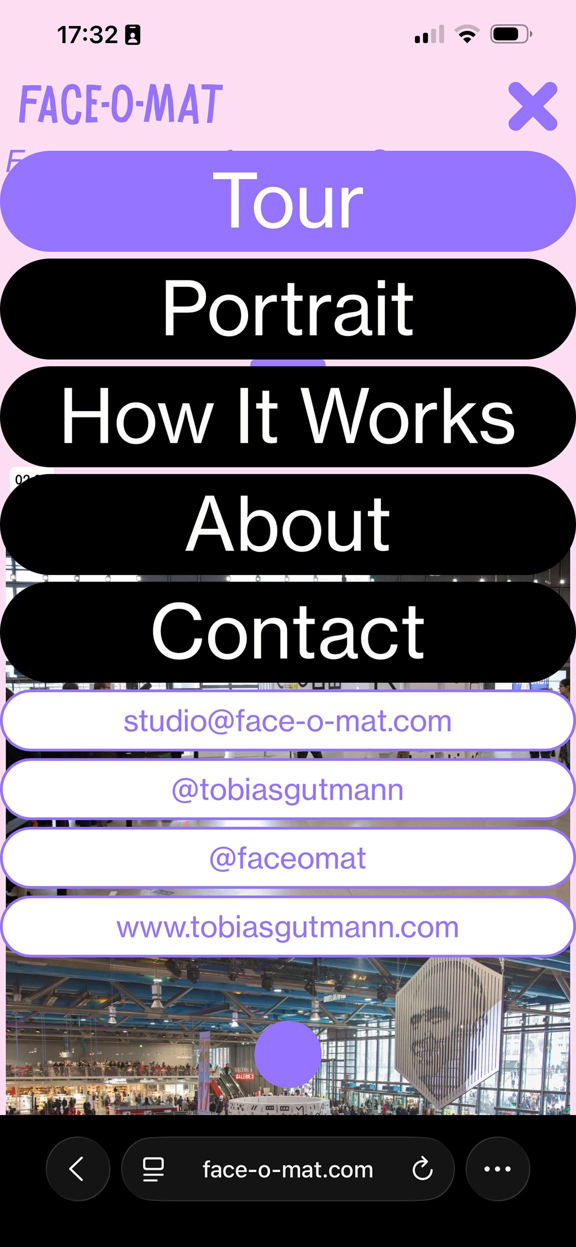
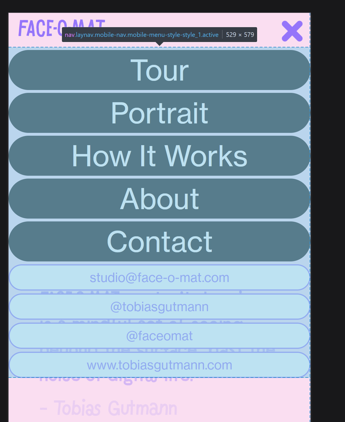
mobile menu Style 1 - dark transparent background
-
I would like to darken the background of the website, when my mobile menu style 1, drops down.
The css rule of the background could be something like the bellow, but I couldn't figure out to what class or div I need to point this css to:/* Transparent full-page overlay behind the menu */ .menu-overlay { /* what is the correct class??? */ position: fixed; inset: 0; background: rgba(0, 0, 0, 0.5); opacity: 0; transition: opacity 0.25s ease; z-index: 1000;
-
well the container of your mobile nav does not span the whole page

otherwise you could just style the background of it
the body has a class "mobile-menu-open"

so you could use that
-
i would just use
.mobile-menu-open .lay-content,
.mobile-menu-open .navbar,
.mobile-menu-open .mobile-title,
.mobile-menu-open .lay-mobile-icons-wrap{
filter: brightness(50%);
}
I also code custom websites or custom Lay features.
💿 Email me here: 💿
info@laytheme.com
Our Web Development company: 100k.studio
Want to tip me? https://www.paypal.com/paypalme/arminunruh
Before you post:
- When using a WordPress Cache plugin, disable it or clear your cache.
- Update Lay Theme and all Lay Theme Addons
- Disable all Plugins
- Go to Lay Options → Custom CSS & HTML, click "Turn Off All Custom Code", click "Save Changes"
This often solves issues you might run into
When you post:
- Post a link to where the problem is
- Does the problem happen on Chrome, Firefox, Safari or iPhone or Android?
- If the problem is difficult to explain, post screenshots / link to a video to explain it